
Sep
30
2016
75% of 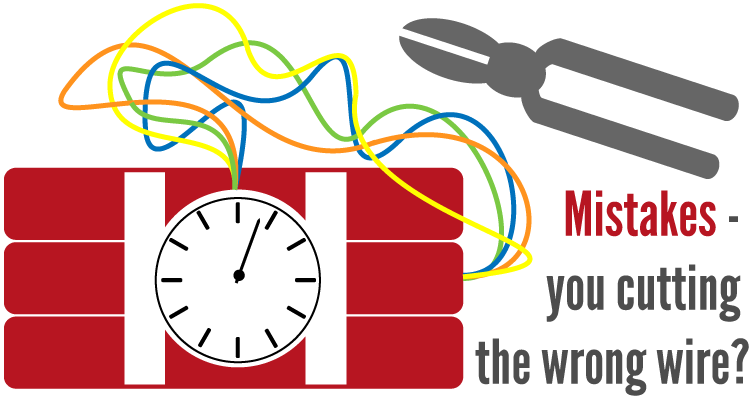 your website visitors will initially judge your company’s credibility based on your website’s design. With competition being so high in Alaskan adventure tourism, starting off on the wrong foot is basically a potential customer death sentence.
Here are the 4 most common design mistakes for Alaska web design. Any look familiar?
1 – Lack of user friendly navigation
If I can’t figure out how to navigate a website, I will go elsewhere immediately. Chances are that you do the same thing. It’s irritating. Navigation is the steering wheel for a web site, and if a user can’t easily navigate a website, then basically they can’t use it.
Navigation mistakes for web design basically comes in 3 flavors:
The modern website visitor has less attention span than a goldfish, and they are looking for very specific information on your website. If you don’t help them get their quickly, then you have lost them.
2 – Web design is not responsive
Responsive web design is an absolute modern necessity. “Responsive” means that your website looks good on any size screen, such as a mobile device like a phone. Considering more U.S. users now access the internet from a mobile device than a desktop, it’s important. Moreover, lack of responsive web design will hurt your Google search rankings.
Here are the 3 types of lack of responsiveness mistakes in Alaskan web design:
Your website should look and behave naturally on any size screen – it’s a modern day necessity.
3 – Not updating your website
This one is easy. When was the last time you updated your website’s design? Does your website contain any outdated data, such as old dates, pricing, or company information? As far as Alaska web design, this is by the most common mistake.
With as fast as technology is moving, websites that haven’t undergone a design update within at least the past 3 or 4 years will start to look dilapidated. Outdated information on your website will give hurt the credibility of your business as being “current” and “in-use.”
Look at it this way, if you had two businesses side by side – offering the same services – but one business has a modern web design and the other one had a dated one, which would you contact first?
4 – Web Design is cluttered
Another plague of countless websites. Cluttered website designs comes in many forms. Too much text and/or too little pictures. Not enough white space, which is “breathing room” between elements such as text and pictures. Way too much navigation. Conflicting color schemes. Lack of consistency between different pages.
You know what cluttered looks like when you see it on a website. It looks messy. It’s not pleasing to the eyes. You feel it right away. It’s a web design killer. What does a cluttered website imply about a business?